Thanks for checking them out!

 “Bill and Ted’s excellent adventure” 9”x12” Acrylic+Ink on paper mounted to board.
 “Beetle Juice” 9”x12” Acrylic+Ink on paper mounted to board.
 “Back to the Future” 9”x12” Acrylic+Ink on paper mounted to board.


 Last May/June, I was lucky enough to work with the awesome brothers that run Confitte, based out of Buenos Aires, Argentina. Their mission statement says "We are a young design label, which seeks to merge in their products that we believe are important values such as innovation, quality, art and respect for the environment."
 The assignment was simple or so it seemed. The art direction was, do whatever I wanted, as long as it has something to do with nature, and hand lettering that had a message dealing with money. I struggled for days until I finally came up with a solution that best served for the product. Something I always strived for, was to take the spontaneity/experimentation of my sketch books and then in turn apply it to my illustration work. Working as a conceptual illustrator tends to be less liberating at times when trying to make new, bold artistic choices and take liberties in new directions without straying to far from what a client would expect from you.
 Fun fact about this project: I usually work digitally, but for this project I hand painted it in acrylic. I don't see much of a difference between this and my regular work, do you?
 You can purchase my wallet, or some of the other finely illustrated wallets here: Tuenda Linda web store
I am creating a bunch of paintings for myself, that are focusing on incorprating painted typography, and adding more relatiable personal experiences in the pieces themselves. To do this I plan on painting them using surrealistic metaphores to bring the viewer relating in some way or another to the works of art.
This is the first in many paintings that are going to take on this approach.
When I got the email and accepted the job, the article was pretty clear. The author, wrote about being tempted to spend a lot of money during the holidays that put aside living sustainable. It acted as a reminder that the holidays weren't about spending a lot of money on gifts but the togetherness of the holiday.
There was a clear metaphor in the article in using a tire wheel as a 21st century version of a advent wreath, with candles and greens. Originally, peasants made Advent wreath's, during the medieval times using the front wheel of a wooden wheel barrel to wrap flowers, greens and candles. I thought a bike tire would be a better image since Philadelphia is a huge bike city and more symbolic of sustainable living. The problem that happens sometimes being an illustrator is getting a great idea to quickly. It seems to good to be true and you hesitate on coming up with other solutions to the visual problem. I pushed through and submitted other sketches that acted as a gradient from concrete idea's to more abstract idea's/artistically liberal approaches that could of loosily told the story of the article. Below were the sketches presented.

Jamie ended up choosing the advent wreath image, which was a relief. So I went out and started drawing the image...

Final Image
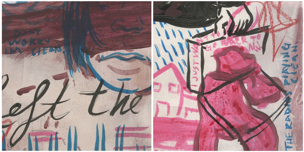
I happen to get my grubby hands on it and fill it with some maddness. I didn't use reference at all so alot of it is screwed up. But what I found out of this hour and a half discord was something. I am not sure what, but something is going on that I really like.
I think I am going to sit with it, create pieces in my spare time that are alittle more controlled and see where it leads.

For all the dedicated selfless hours you put into this collective, and including me into this special group of people almost 2 years ago.
I'll be thinking of you when I listen to the song "California Love".
 Is the future of illustration in Animated Gif's in the markets of Advertising and Editorial's new mediums of E-Paper/E-Ink, and The Kindle?
I think it's a matter of time before illustrators will start to discuss the pricing and ethical use of Animated Gif's made by illustrators. Who knows when illustrators will start getting jobs to animate things. For animated E-Ink Wine bottle labels, E-Ink Advertisements on the sides of bus's, Animated Illustrations for publication on Kindles.....
Above is a piece I did for school to slowly start getting a grasp of the medium to prepare for this shift.

Just a reminder, Both the Society of Illustrators pro show and the Creative Quarterly contests due dates are October 30th.
SOI - $30 an entry
Creative Quarterly - $10 an entry
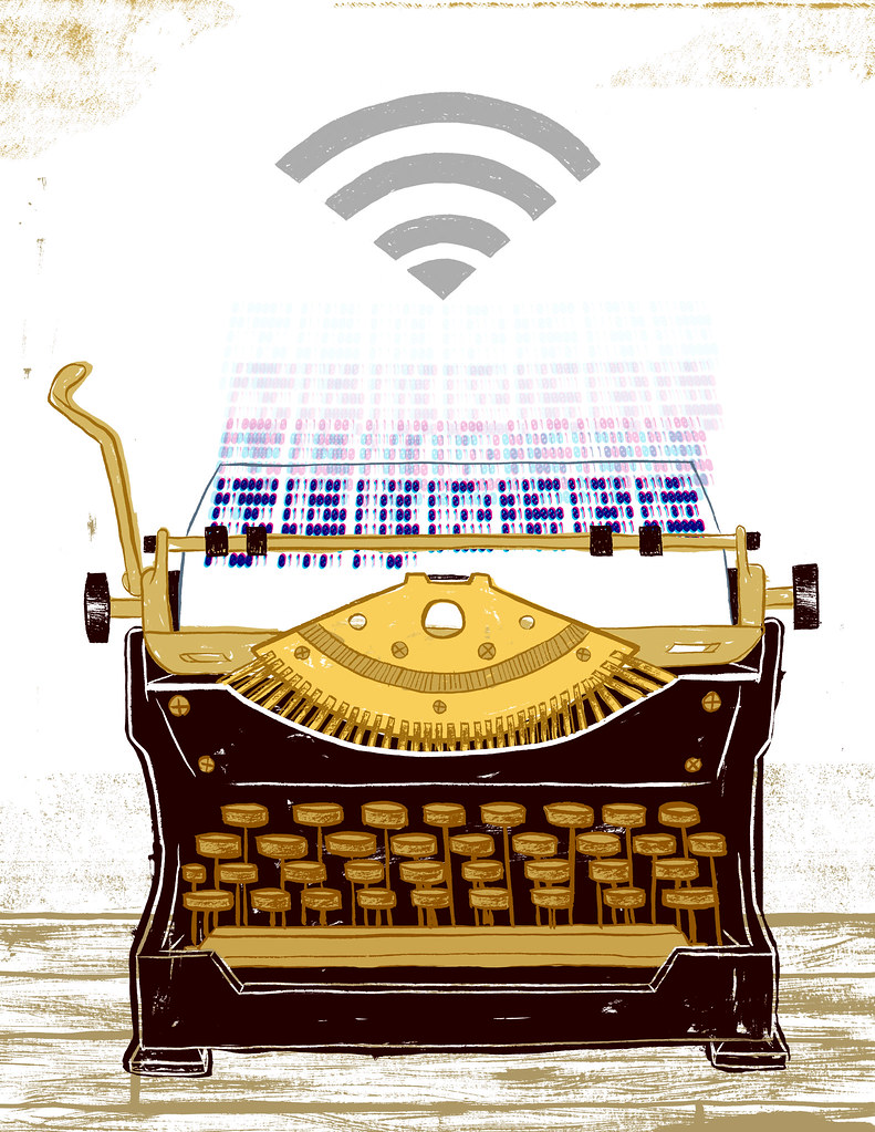
This is just one of a few pieces I have been working on as of late and is one of my promo cards I am sending out at the end of the week along with my skidmore college piece. The quote is from the book "The Medium is the Message", which is a must read for anyone. Takes 4 hours to get through it so why not. It predicted the internet 30 years before it was invented.
Also, check out my website with new java script madness I have added to it.

It's been about a year since Orphan Works has been at the forefront of discussion in many circles. It seems like its only on the table of awareness if its finally come to go to battle. None the less, more and more I see images on folks websites with "(c) Artist Name" below the image. This is all fine I guess as long as a big ugly watermark isn't blinding me. I've found a more simpler solution to this problem.
I was screwing around with photoshop this morning before starting a piece for school and I found something interesting. Every scanned painting or digital painting you create has metadata, that tells you different things. It tells you the size of the file, the height and width, ect. Did you know that you could also put your contact info, copyright and a whole lot more in it?
Also, if someone pulls your image off the web, and deletes that data to claim that they made the image before you, you can show them the modification dates in the file. This then shows you in fact did make the file before they just tweeked the metadata to try and claim it as there own.
So yeah, continue putting "(c) Artist Name" on your images if you want, but this is a layer of protection that will help you in the long run and it takes 5 minutes of your time before you send a file off to a client or throw something on the web.
You can do this in any Adobe program. Just go to File > File Info and then fill in everything you need to fill out.
Make sure to keep a PDF of all your images as well. PDF's can't be changed at all and hold up in court alittle better and only add to your protection of your artwork.

Did this a few weeks ago, though it was a piece for the New Kids on the Block show. I sold the painting but didnt get a good photo so I just took my original drawing and re-colored it. She asked for that image specifically. This was the cover of a packet for Skidmore college on the issue of Coping with Culture Shock as an international students in America.
Also I re-designed my website so that it fits nicer on a large format screen. Check it out!

Here is my submission for the DIA DE LOS MUERTOS show at Proximity Gallery. I wanted to focus on the religious aspect of the holiday and how it brings people closer to those who have passed on. I had alot of discussion back and forth with my room mate, Rachel about the piece so that it would read well and clear enough to get the idea across I was going for.

I just got done printing 100 of these bad boys, and sent them off to California, where the band The Motel Life (not to be confused with The Movie Life), will be playing a short 2 week tour. I do not have extra's so you gotta talk to the band if you want to get one of these posters for probably $5.
When the band contacted me back in July, they literally said, interpret the quote "(So Sorry) We're not what you're looking for" in your illustration. I took a week to think about it since the deadline was far enough away, and sent off sketchs. Got the final word a week later and did the finished image in a day.
The image they chose, was one that represents a 90's indie girl displeased with what she saw through her camera lens. Sketchs are below.

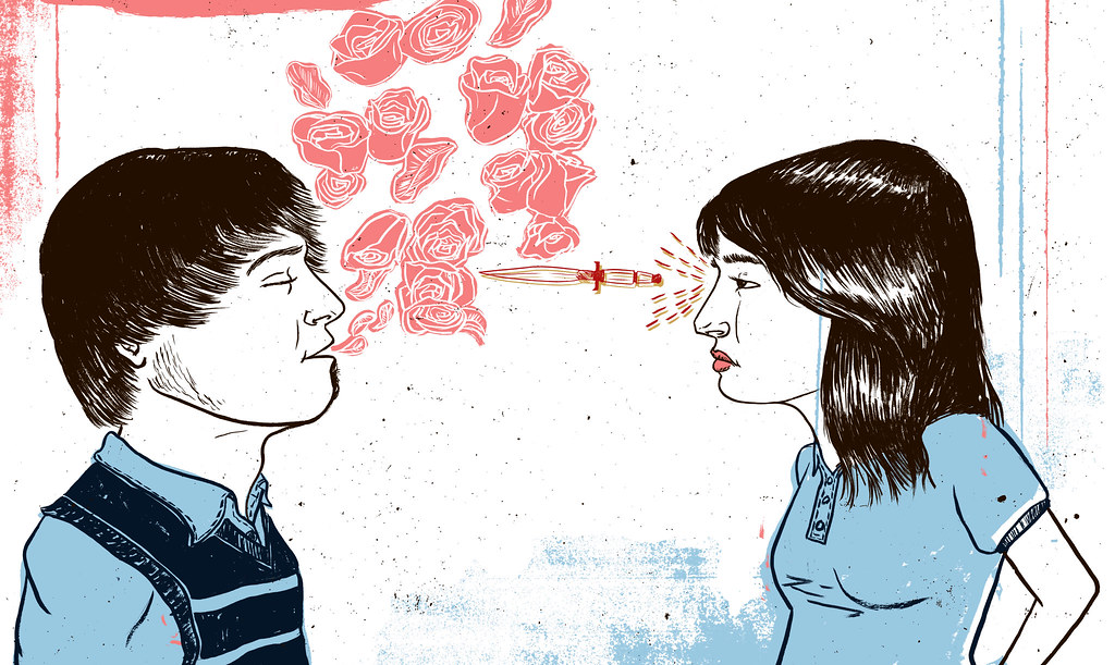
I just finished updating my website. This image is a favorite of mine out of the new pieces created. It's pretty self explanatory. This is one of the images I am screen printing into an accordian fold book.