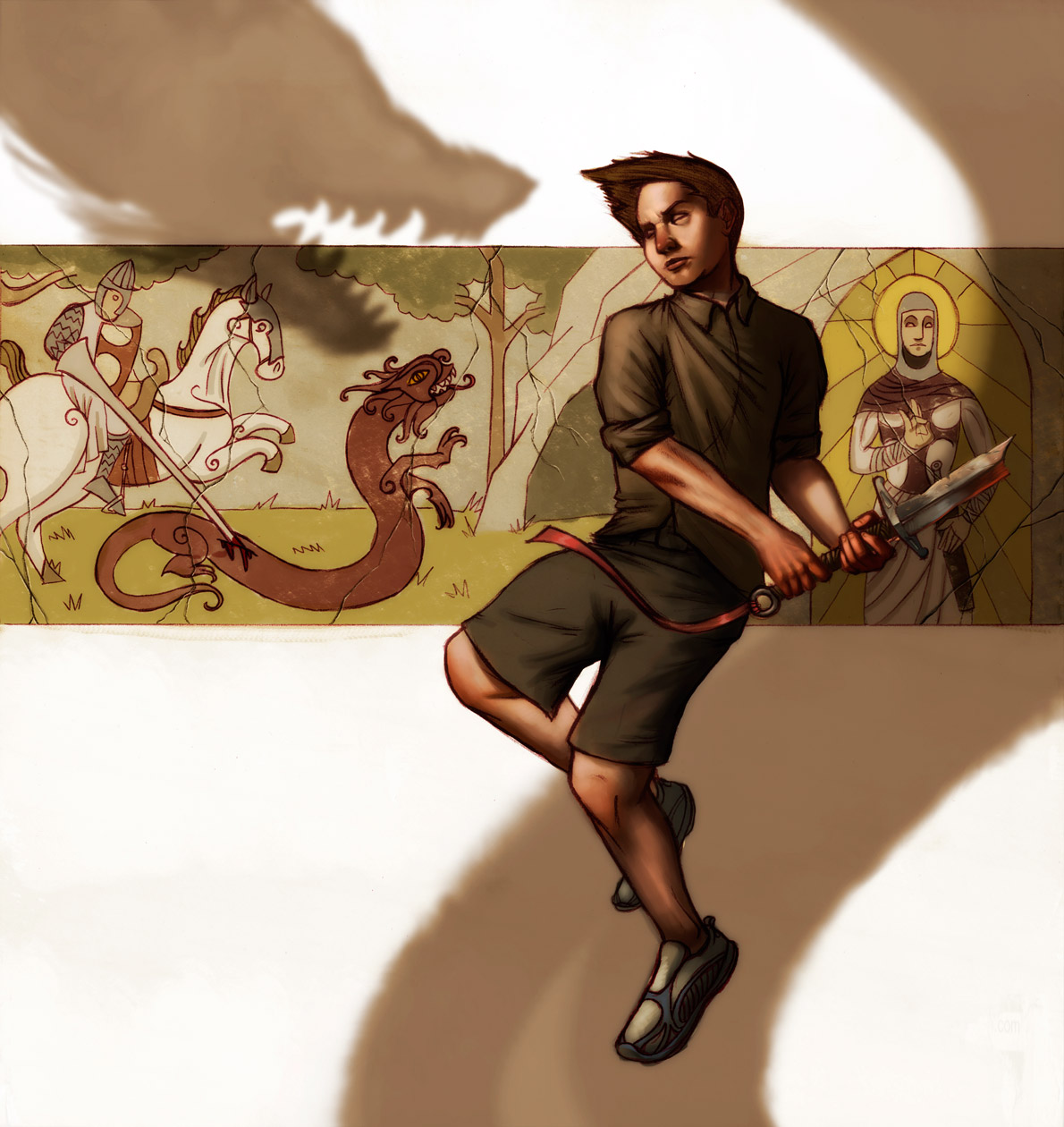
 Hi all. Here's the final for my "Dragon" themed illustration. It was a bit of a struggle getting it done in certain areas, but in general I think it's a successful piece. I wanted to do a piece that wasn't so quiet, like my last few. So, a little more action and a pose that wasn't so stoic. I also wanted the skin tones to be kinda pale so that I could play up the reds in the hands more. Hope you guys like it. Later!

Tuesday, September 16, 2008
St George, Le Fin
Hi all. Here's the final for my "Dragon" themed illustration. It was a bit of a struggle getting it done in certain areas, but in general I think it's a successful piece. I wanted to do a piece that wasn't so quiet, like my last few. So, a little more action and a pose that wasn't so stoic. I also wanted the skin tones to be kinda pale so that I could play up the reds in the hands more. Hope you guys like it. Later!
Subscribe to:
Post Comments (Atom)
4 comments:
looking good there man! I have to admit, being a bit of a detail man, the texture on that back wall that you dropped in very subtly is awesome to give it that worn off / chipped paint feel to the mural. I'd say you successfully completed your goal of doing something different from your other latest ones. Nice :]
also.. that sword looks awesome, i am looooving that red reflected light on the back end of it.
yeh really great stylization in the background.
Tim, this is a nice finish. It has nice background elements, but nothing to overwhelm the illustration.
This is pretty rad man. That broken sword says a lot. I think a book could be written just off this Illustration!
Post a Comment