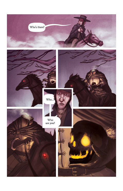
Hi everybody- first thing, congrats to everyone in the Joker show! It was an impressive display to say the least. The above is a new page in my Sleepy Hollow book, where the Horseman finally makes his appearance. The editor likes to shy away from the overtly ghostly in this story, and tries to stay on the traditional side (so as to not lean on the Horseman's true identity one way or the other), so I was happy that he let me keep the mist that swirls out of his cowl that I added. The book is due out in May.
This is a sketch for an upcoming promotional piece. For this next mailer I wanted to develop a picture that could be applicable in a lot of different places, and the main concept it of course "growth." It could be about inspiration, hope, recovery, spring, gardening, or economics and hopefully potential clients will see a lot of possibilities in this piece. Thanks, all!


5 comments:
Nice page and sketch, excited to see how it comes out.
Nice! I really like the promo card idea. I know you were explaining it to me the other day, it's nice to see the sketch of it. It's a cool concept.
sidenote: I really like the horse in the comic page here, the glowy red eyes, so good.
very solid page, tim! lighting looks great and i'm glad they let you keep the mist coming out of his neck! maybe my favorite part of the page.
the card sketch looks great so far. i personally think it works really well as an economy piece that coincides with spring. it definitely looks like a struggle
Looking quite outstanding Tim! Can't wait to see the entire book in May! That spring piece is shaping to be something special! Will you be adding that to your seasons pieces? Godspeed amigo!
exciting stuff, as always!
Post a Comment