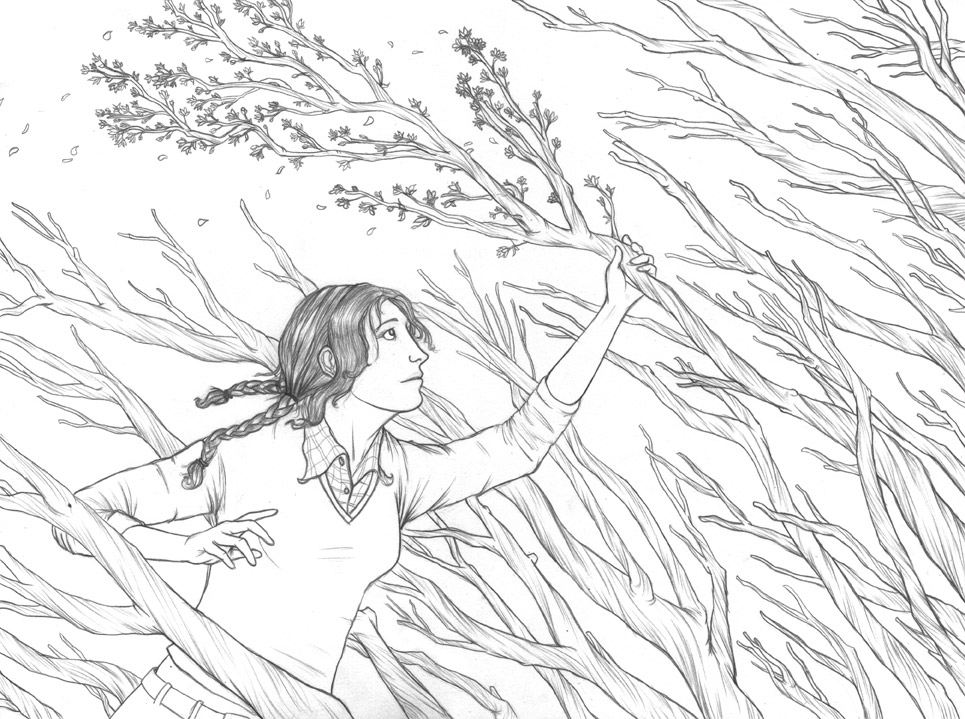
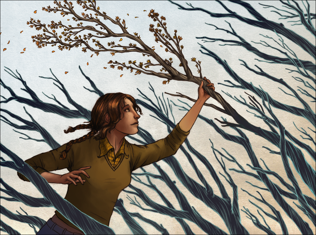
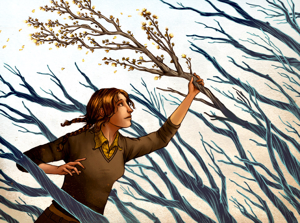
I tried a couple new things, like the texturing on top and the the lines are handled in the branches. With the latter, I was hoping to showcase the drawing a little more than if I had rendered it and I'm hoping to get a good response with this one. Regardless, I'm happy with it and think it will make a good addition to the show. Below I wanted to post some progress pieces, so there's the sketch, drawing, in progress, etc. It's kinda funny to see the changes from the original sketch- mainly the proportions of the head..yikes. Thanks!


6 comments:
i have to give it to you, tim. i think this is one of your strongest pieces yet. love the color scheme. using the blue linework for the branches was very smart.
really nice piece man!
I think this turned out really great, knew it had promise from when you first mentioned it to me a week or so ago. Right on. I agree about the color scheme and color of the branch linework, nice touch indeed.
I agree with Mr. Stabwell that this is one of your best yet! Great colors and layout!
thanks a ton, everybody. glad you liked it
we were talking about this piece (viewing the postcard for heart-earth) on the subway last night. i love them dark branches!
Post a Comment