Showing posts with label punk. Show all posts

Friday, August 6, 2010

First solo show! Scott Derby: Illustrations, August 6th at Primer Gallery

Hello all,

It has been a while since I've posted here, but I wanted to let everyone know that I will be having my first solo show of work on Friday, August 6th, 6-9 pm, at the Primer Microgallery in Hatboro, PA as part of Hatboro's "First Friday" event. It will be a collection of both older and newer work, originals and prints, most of which will be available for sale.

It's a great location, and I am honored to have been invited to show my work at this small, but very hip, design firm/microgallery.
Food and drink will be served, so if you're in the area, come on out and say hello.

For more details, check out Primer at http://Primerinc.com

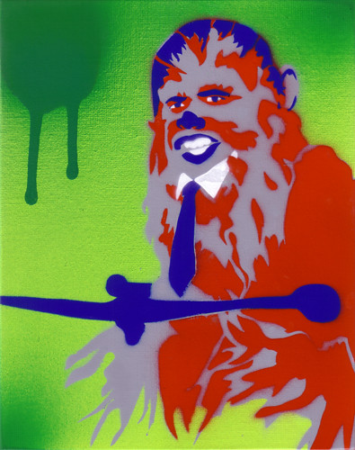
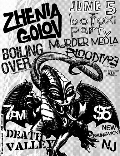
The above piece, done specifically for this show, is basically a self-portrait, circa 1986 or '87, illustrating how music, primarily the punk genre, blew my mind and changed my life... I wanted to show some of my favorite bands and some of the albums that I first discovered when this amazing music form reached out from behind shitty commercial radio and arena rock to grab me by the nut sack. I guess I can call this "Portrait of the artist as a young punk"...

Friday, March 5, 2010

Ban Lightning, Not Pitbulls


I drew up this logo for a Facebook Group that my girlfriend started, The Society to Ban Lightning, Not Pit Bulls. From the page:
"Lightning kills more people per year then pit bulls do. Logically we should be concentrating our effort into putting lightning rods at 50 foot intervals all over America. Please help us!"
It's a kind of lighthearted approach, with a serious message. The main design and lettering is a parody of the first Bad Brains album. I re-drew the lettering to match, and the pit bull I had drawn for a t-shirt company (which never used it). If you use Facebook, feel free to join!

Friday, October 9, 2009

Double Negative flyer


I recently did this flyer for a show that my band, Wormeaters, is playing in Philly. With this flyer I really wanted to take a swing at not using any fonts, and doing all the logos/ lettering by hand.* I used an ink dropper and brush to get the look I was going for. I think it has a real organic feel, which a lot of Photoshop heavy full color flyers are missing out on. The main image is of Magik from the New Mutants comic. In the original comic she had a pentagram between her arms, but I changed it to a version of Double Negative's logo instead. It's a month away, but mark your calendars, this show's sure to be a ripper!


*the address of the venue was added later using a font. The promoter also later wanted descriptions added, so I had to use fonts on those as well.

Wednesday, June 17, 2009

this one's for all you hardcore punk metal freaks

I've been kinda busy this past week doing a lot of design work for bands.
Here's 2 shirt designs I did for Coke Bust from Washington DC. They're doing a US tour this summer and needed new shirts, and since I'm their buddy I offered to do some designs. Here are the 2 that got chosen. The first one is an image of a war veteran, which references the song "Patriot" on their new LP (which by the way rules). The second design is the tour shirt. The front is a pocket print of a traditional eagle tattoo design, and the back has all the dates. The first date of their tour is in NJ and the last in Philly, I will be at both.

Here is a flyer and t-shirt design I did for Felix Frump's reunion show this weekend. Felix Frump was a great pop-punk band from NJ, who Is aw a ton of times back in the late 90's. I'm really bummed I can't make their reunion show, but I got to do some design work to help at least. The flyer I was basically given full control over what to put on it. I rarely get to design flyers in color, so it was really cool to play with different textures. The shirt design was the band's idea to rip off the Jack Daniels bottle graphics.

Finally we have the poster for this year's No Way Fest in Richmond, VA. No Way Records always puts on an great fest, and have been awesome enough to have me do the posters all 3 years. The original design was done by Brandon who runs the label, and I cleaned up the design and replaced the hand drawn logos w/ the bands' actual logos. I also added color. There will be 200 #'d posters on sale at the fest, and any leftovers will be on sale in the Vinyl Conflict webstore. There will be shirts of this design as well, but just the black layer. Unfortunately I forgot one of the bands on the posters, but I was able to fix it in time for the shirts to be correct. oops...

Wednesday, June 3, 2009

Chewbacck Obama and some Munnys

Here's a bunch of stuff I've done over the past few weeks:This was a dumb idea I had, more so just the name Chewbacck Obama, popped in my head for some reason. In order to get it out of my brain I drew this up and stenciled it on a 8"x10" canvas board.

Here's a Munny I made as a gift to my tattoo artist who's been hooking me up w/ some sweet free tattoos over the past few months. I wanted it to look like an old timey strong man w/a sweet mustache (made of craft foam). I gave him traditional styled tattoos which I drew on with Sharpies. Here's what he looks like from all angles.

This is a Mini Munny body which I attached a TV accessory from a regular sized Munny. The basic concept is "TV rots your brain." The Munny body was pink, and I masked out a brain pattern and then sprayed the whole thing red. The TV screen I painted w/ a textured gray to look like static.

This is a flyer for a show my new band BLOODTYPE is playing. It's the same day as the 80's show unfortunately. If anybody's gonna be in the area and wants to see me sing in a band, this would be your chance.

Also, if any other society members use Twitter, you can follow me here:http://twitter.com/BleedingEdges

Friday, March 27, 2009

Family Guy and some toys

I had this idea one night watching Adult Swim, and decided to work it up. Sometimes you have to actually follow through on dumb ideas. For those not in the know, it's based on Black Flag's not so classic LP, Family Man. I'm moderately happy with it. Raymond Pettibon's original art's human proportions were pretty crappy to begin with, as well as the Family Guy's human proportions being off as well. Consider it "pop art."
Here's a project that took me a while, mainly because I was avoiding doing it. This is the Mini Munny Mobile DIY vinyl toy. I added the wings on the back and did this sleek paint job on it. The character is basically a cross between Lando Calrissian and a stereotypical 70's pimp. If anyone can hook me up with the windshield accessory, I'll gladly trade. The paint job kinda fades from black to blue, which was kind of an accident, but I think it rules. The blue metallic paint was a lot thinner than I thought, and mixed w/ the orange under it. I used a textured paint on the guys hair, then painted it back also.This last guy was made from a Dunny body, and a poop accessory from a full sized Munny. I thought the poop was kinda a lame accessory, so I turned him into a sort of living ice cream cone. It's blue because I had an awesome blueberry cheesecake flavored ice cream a few weeks back that really left an impression on me.
Hope to meet a bunch of you at the Joker show next week!

Tuesday, March 17, 2009

ONE NINE NINE FOUR

Since I'm on a roll with animation, film, and children's book / comic adaptation news, here's some news for you Punk Rock and Documentary lovers.

One Nine Nine Four is a documentary about the rise of punk rock in the 90's, specifically in 1994. Here's a teaser:


More at the official site: ONENINENINEFOUR.COM

ALL IMAGES, ARTWORK, AND WORD COPYRIGHT © THE AUTUMN SOCIETY & ITS INDIVIDUAL MEMBERS / ARTISTS

the autumn society IS COPYRIGHT 2010 THE AUTUMN SOCIETY. ALL RIGHTS RESERVED. NO PART OF THIS BLOG AND ITS CONTENTS MAY BE REPRODUCED WITHOUT PERMISSION OF ITS MEMBERS / ARTISTS.